
Olympic Games Unveil a Comprehensive New Visual Identity
The Olympic Games’ 5 rings remain unchanged as a symbol. So, what is changing.
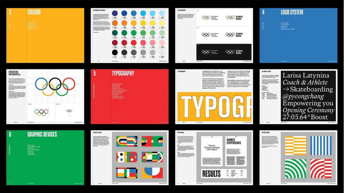
The Olympic Games brand is entering a new phase with an interesting and comprehensive visual system, as well as an extensive style guide, according to the International Olympic Committee (IOC).
Needing a revamp, the changes come more than 100 years after the first modern Olympics. Canadian agency Hulse & Durrell led the project to develop a complete visual system. Other international professionals, including typographers and illustrators Julien Hébert, Abbey Lossing, and Karan Singh, also contributed to the effort.
The new system includes a revised color palette, three custom typefaces, graphics, illustrations, and general usage guidelines.
The Rings, Symbol of Olympism
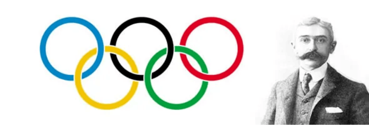
The symbol of the Olympic Games, with its five rings, is one of the most recognized icons in the world. Its design dates back to 1913, and its creator was none other than Baron de Coubertin. He was inspired by the emblem of the French Union of Athletic Sports Societies which features two overlapping rings.
That symbol has been accompanying the different editions of the Olympics, alongside the logo of the host city. Although, there have been some exceptions such as the 1972 Munich Games that had a black and white spiral design. Since there are no current guidelines, the some of the combinations of host city and Olympic logos have been quite unorthodox.
What do the five Olympic rings mean?
While there were no comprehensive guidelines, the IOC does have an Olympic Charter that includes some direction. According to Article 12, the five rings represent the union of the five continents and the gathering of athletes from around the world at the Olympic Games.
Before the 1991 edition, the rings had to occupy at least half the width and length of the distinctive signs. With the approval of the new version, cities could create logos where the Olympic symbol did not exceed one-third of the total area.
New Style Guide: A Solution to a Long-standing Issue
It’s striking that such a massive and enduring brand only had these small premises as a style guide.
The charter created numerous problems over the past 100 years, leading to a gradual evolution of the brand. Thus, the IOC in 2022 recognized the need to create a comprehensive identity designed for use across all media and channels. They intend to use this on social media, during website creation for the host city, and more.

A Comprehensive Design System Bringing Balance, Cohesion, and Flexibility to the Olympic Games Brand
May Guerraoui, the Brand Management Director at the IOC, spoke about the project for the new comprehensive visual identity. “The evolved brand further enhances the Olympic brand identity through an extended and vibrant palette based on Olympic colors, inspiring illustrations, and custom typography.” She explains, “It’s about leveraging a new design system to communicate the brand’s values with emotion.” We are just as excited as the IOC for their new brand kit.
Let’s delve into the details:
Color Palette
The Olympic rings are one of the most recognized symbols in the world. "Nine out of ten people correctly identify the symbol when shown," says May Guerraou. And in this regard, the color palette is an ally.
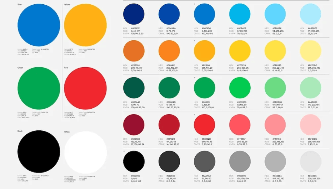
Because of this review of the Olympic Rings’ recognition, they wanted to keep the general symbol and colors. However, they wanted to expand to complement the new visual system. The core colors of the Olympic Games: red, white, blue, green, black, and yellow, are reinvented with this new system.
Moreover, they revamped the tones and colors of the three medals to adapt to the variation of digital interfaces. “The entire process was based on the need to balance tradition and modernity,” May points out.
Logo, Graphics, and Illustrations
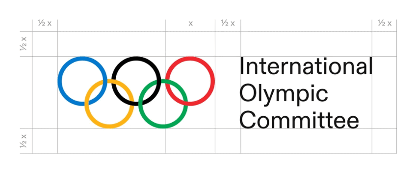
While still following the heritage and spirit of the original, the new logo is reorganized within the entire new brand system. This makes perfect sense to establish hierarchy and coherence that allows it to adapt to all platforms and to keep the well-known, traditional, logo intact while bringing in fresh elements. The new emblems require specific spacing to ensure homogeneity across all instances where they are being used.
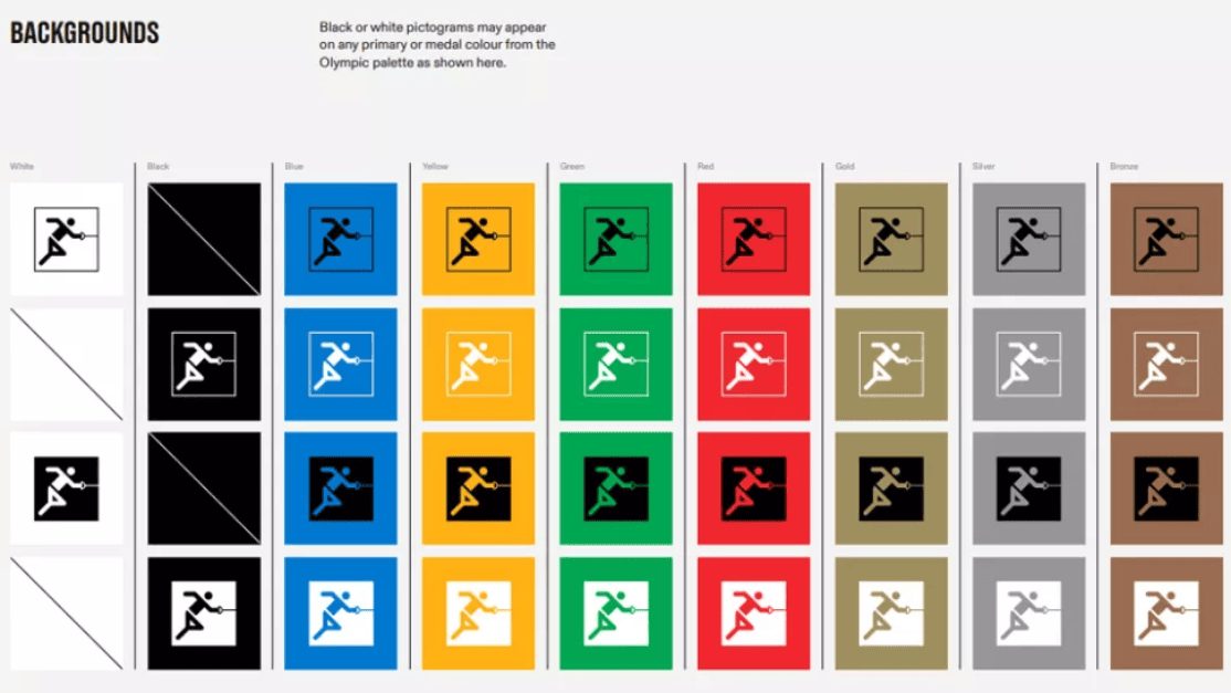
On the other hand, within the new visual system, we find a set of graphics inspired by the geometry of the playing field of various sports. Also included are the pictograms representing all Olympic events.
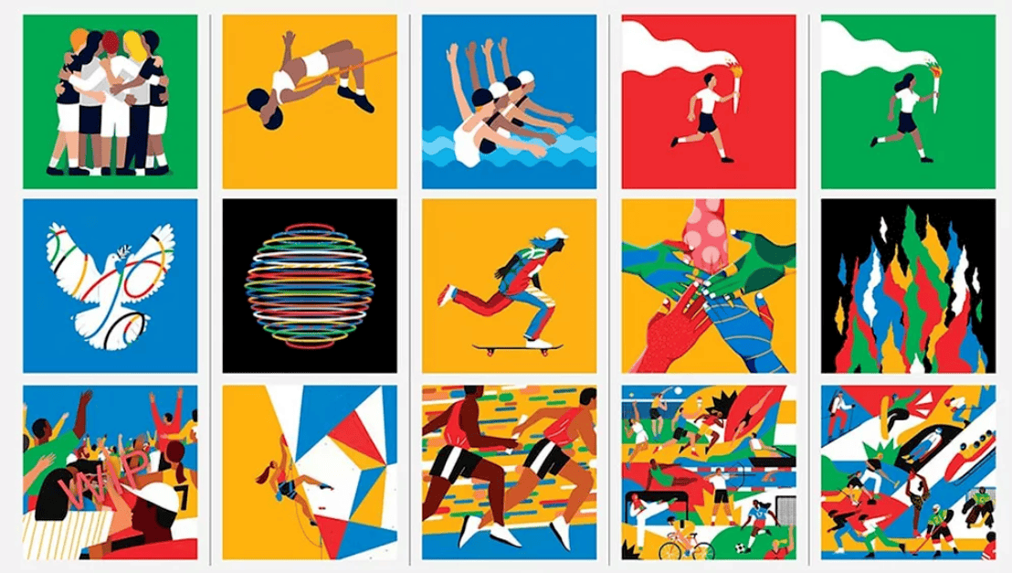
The illustration section is especially notable. The visual system includes 17 official illustrations hand-drawn by artists Francesco Ciccolella, Abbey Lossing, and Karan Singh. The colorful and vibrant designs intend to capture the spirit of the games.
The style guide includes numerous guidelines and recommendations on the use of each element and how they should be applied, from illustration styles to photography and infographics.
Typography
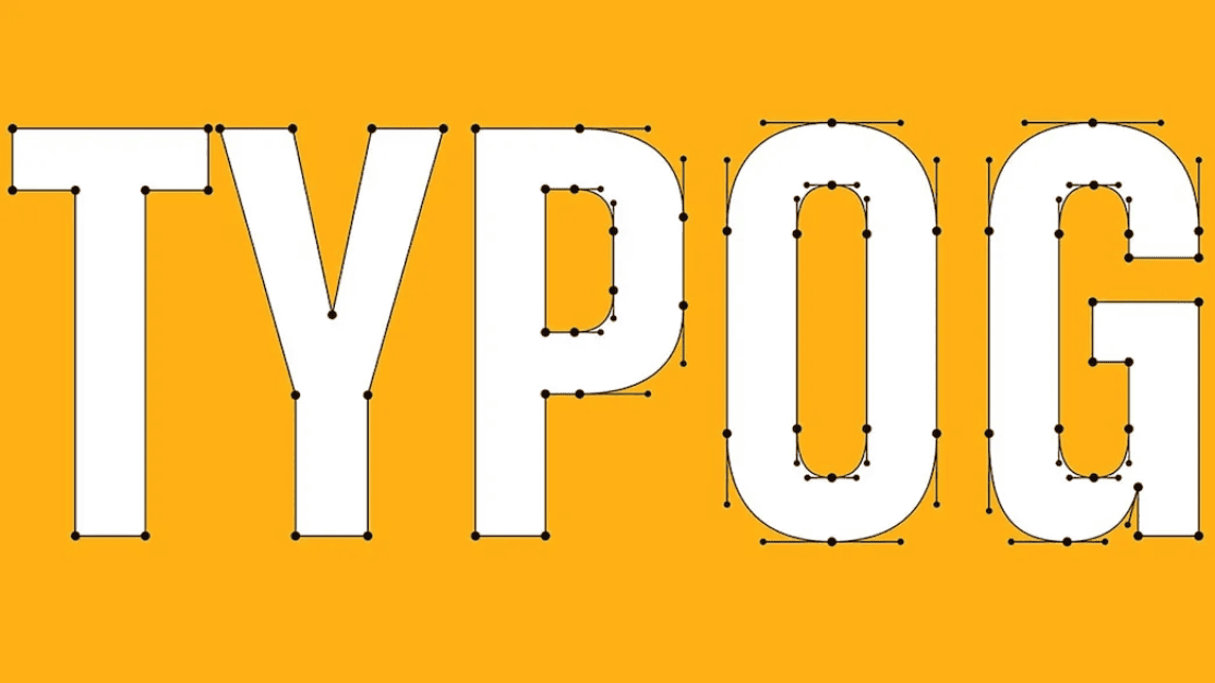
The IOC has also unveiled the new typeface set. The Olympic Games brand now features three new fonts for various uses: Olympic Headline, Olympic Sans, and Olympic Serif.
They tasked Fabian Harb and Seb McClauchlan from the typographic studio Dinamo, and Julien Hérbert from the Canadian design agency Principal, with developing this section. The first, in all caps, is described as “bold, athletic, and proud,” and was inspired by the typography used in the emblems of Tokyo 1964 and Seoul 1988.

In the end
Overall, the work is exciting and inspiring. The assets of the new system undoubtedly help to organize and prioritize the complexity inherent in the Olympic Games brand, while also gaining richness in its global deployment. A brand poised to compete and play for the future.



Leave A Comment
You must be logged in to post a comment.